CSS Gallery  Three columns, Clean & Clear
Advance Leaflet
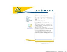
This handsome design is supported mainly by that nice outer frame surrounding the page. Rather interesting.
Color Scheme
- Hovered color:
- Selected color:
Comments (4)
The left column is broken in Firefox. However a good design.
I'm running Firefox 1.0 and the left column doesn't appear to be busting out of place. If you are referring to the identity at the bottom left side, I believe that was intentional. It's part of the footer image.
Yes Matt is correct. It is intentional to have the left hand side jagged. The site suppose to look like an open brochure.
I almost forgot to complement the design.
I like the color scheme and the structure is very smooth.


