CSS Gallery  Mixed cols and rows, High Contrast/ Impact, Corporate or Professional, Our favorites
Advanced Recovery
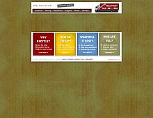
It's atypical for a ecommerce/ business site to employ this type of "little text", portal layout for the frontpage. I like it from an aesthetic point of view, though IMO a long winded sales pitch right on the frontpage would be better at grabbing potential customers.
Color Scheme
- Hovered color:
- Selected color:
Comments (1)
Simplicity and ease of use is what sets this site apart from other business sites. I like the way everything is geared toward what the customer wants to do rather than how great the company is. I can't imagine that people want to spend a lot of their time recycling computers. This gets to the point quickly. Great design.


 Retrieving RSS feed(s)
