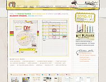
CSS Gallery  Two columns, Yellow color scheme
Ahhh Design
Color Scheme
- Hovered color:
- Selected color:
Comments (5)
I am providing feedback because I want this site to be amazing. There are so many great things you can do with this that you arent.
First, I'd start with some CSS3 Animation for the rollovers. Let's bring those bad boys alive. You hardly have any feedback for the visitor.
I'd also change the font in the navigation, something bigger, better, and more impactful. Try typekit.com and get references for fonts you like. Typekit will let your navigation be text, which will help with the SEO.
Also, add more white space...the site is very tight. Open it up a bit and make it bigger, who cares if people have to scroll, it depends on the overal strategy of the page.
I agree with Blue Sail Creative with the exception of the animation. I find it distracting and annoying. Animation is my #1 reason for leaving sites, even those that I find extremely interesting. Keep up the good work Ahhh Design, love your fresh, fun, artsy design!
By animation I mean very small enhancements.
Check out the Comments button on http://www.jmorganmarketing.com. We did this with CSS3 and it only works in safari 4 and firefox 3.5, but it doesnt break the experience for people with older browsers.
I agree, those are very nice rollovers. Since I am not in the graphic design business, I never considered those as animation. I also like mouse rollovers when the colors change or highlight, just not the constant movement of some animations.
Thanks for all the great feedback - working on the navigation is next on my list and I'll definitely keep this in mind.
-Amanda


 Retrieving RSS feed(s)
