CSS Gallery  Three columns, Clean & Clear, Vertical CSS Menu, Corporate or Professional
Best Plots
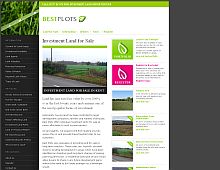
Very clean and stylish design. Great logo too. I wish the text on the rightmost column were a tad bit darker, however.
Color Scheme
- Hovered color:
- Selected color:
Comments (7)
This is a lovely site. Great colour scheme, and (considering how many options there are) unobtrusive navigation. Really nice.
Very clean, simple and effective.
I do wish the layout was either liquid, or narrower, though; I can't see the full page on my 1024x768 desktop unless I maximize my browser window, which I don't like doing because I have other programs, like AIM, that I'll want to be able to see on my desktop at all times.
Other than that, great, clean design.
I am trying to create a site of for a school project. I wondered how you worked the navigation of your website. Did you create the first page using a template or frames or a table
Bridie
I like this design, very sleek and professional looking. Good work.
Hi,
Many thanks for the comments from everyone and thank you CSS Drive for listing our site - it's very much appreciated!
Bridie - the page was primarily designed in photoshop and then created in layers with CSS. Repeat items, such as navigation menus, were typically saved as library items.
Hope this helps!
very nice colors. It looks awesome!
definitely a nice look at fee, color scheme is pretty nice as well.
stock market day trading daytrading stock market day trading online stock trading stockmarket stocks market stock trading stock investing stock market investing stock market trading trader free online trading option trading options trading money management day trading capital stock analysis


