CSS Gallery  Two columns, Corporate or Professional, Unconventional Designs, Blue color scheme
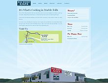
Blue Bonnet Cafe
Color Scheme
- Hovered color:
- Selected color:
Comments (7)
too blue.
light blue text on lighter blue background sounds sexy - if you're John Bobbit, not so much if you're eyes are straining to read the (@*!
stupid IE6 notice: If you're smart enough to detect IE6, install the appropriate hacks as well and shut the f*ck up!
2/5
ha ha...that's funny... telling me I have ie6, but not actually designing to accommodate it...If I have ie6, why would I go through all of the update process to see your site? If I want to update ie6 I will, otherwise, build a site I can view in ie6!
I do similar IE6 notices. People need to keep up with the times and quite using crappy browsers. Designing for IE6 enables slackers and is a waste of time imo.
Steve, you actually charge clients for your services? Its unbelievable, that a "web designer" could be so naive!..
how about this thought, as a "professional" web designer, you need to "keep up with the times" and realize that ( as much of a piece of crap it is ) ie6 is still used extensively, and to think lil' ol' you can change that, you're just kidding yourself! "Designing for IE6 enables slackers and is a waste of time imo." ??????? WOW! I hope my competitors have your attitude, because if they do, I'm going to be BUSY!!
IE6 has about a 19% share of net usage. That's way too much for a bad browser, but since you have to be running XP or higher to get 7 or 8, that's all some people can get (people running win2k can't upgrade).
With as many workarounds available for IE6, it's inexcusable not to have decent downgrades.
Is this site biased? They can't accept my design for my site why? everyone else has showcased it
Awesome Article, Really very informative posting which provide lots of informative in all the regards.thanks for the wonderful posting.


