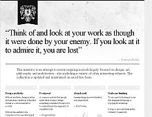
CSS Gallery  Mixed cols and rows, Clean & Clear, Corporate or Professional, White color scheme
Bora Nikolic
Color Scheme
- Hovered color:
- Selected color:
Comments (7)
Nice and clean, though I would like an accent color just to break the monochrome stranglehold.
Very nice grid design. I like the twitter feed at the end.
This design is not really cool with me
eeesh... ugly.... that left aligned is just bad!...
I would add one big image that spans the width of the page. Make this image high in color and high in impact. You can use this as a marketing piece because the website is void of color so you will have ALL of the eyeballs on the website drawn to it.
the background is somewhat interesting, but overall it's just too light/white and not very appealing. Joe
This layout is interesting. A clever use of typography complemented by a well thought out grid. The "negative" version of the twitter feed detail page (http://inspire.boranikolic.com/twitter/) is genius. I disagree with the previous comments, I believe the intent was to utilize a stark contrast devoid of color.


