CSS Gallery 
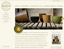
Ecoforms
Color Scheme
- Hovered color:
- Selected color:
Comments (9)
Pretty much an ecofriendly looking website. Use of colors is just too cool.
This is a great website. I like the photos of the planters. The website loaded fast and was easy to navigate through. Good use of css.
Tony
Brisbane Web Design
I like the combination of the colors. The design looks more realistic than any other template. Perfect for eco-related sites.Sam Jones
get web based free project management software online
its good design iam agree with this design css....
Nice colour combination - great site.
Fruit Cages
Color is very important in web design, and can be used to add spice to your website, relay the mood of a page, as well as to emphasize sections of a site meme büyütme. If you think about it, as soon as you look at a website, you can normally guess within seconds what that site is all about meme küçültme. Just like we all are quick to judge other people by their appearance, and surroundings by the way they smell, look, and feel, we also judge a website by its color scheme and style of design burun estetiği. We can usually tell almost immediately, whether a website is corporate, personal, whether it is for kids, teens, or just for adults, etc lazer epilasyon merkezleri. Most of this information is perceived solely by taking in color and design elements burun estetiği. We use color intuition every time we design Ästhetische und Plastische Chirurgie. It is very intuitive to know what colors are appropriate for a specific website topic göğüs küçültme. When you sit down to start designing, you probably take a look at the blank Photoshop screen and know by pure perception which colors are off limits to that specific design burun estetiği. For example, you wouldnt use blue, red, yellow, and green for use on a website design for an insurance company karın germe ameliyatı. However, this color scheme would work fabulously on a website for a preschool vajina daraltma. On the other hand, You wouldnt use black, grey, and brown for use on a preschools website, but this color scheme would work wonderfully on an insurance companys website vajina estetiği. I didnt have to tell you this, with the use of your color intuition, you knew this without even being told cinsel organ estetiği.


