CSS Gallery  Two columns
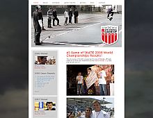
Game of Skate
I love the jagged menu links at the top and clever use of a non-tiling background image to really give this design some bite.
Color Scheme
- Hovered color:
- Selected color:
Comments (5)
It is awesome!
it is really great!
The red navigation image is really very original. Perhaps the footer should have some "zing zang" too because i find it too simple and contrasts too much with the header. But overall it's a very clean design :)
its really a cool design but the skate is out of the template or is it just in the image :d?
Stirman is a true artist and Technological genius. I have a non-profit organization and Stirman has provided idea that will be implemented into a website that will go beyond the norm. There is a great need in helping western society connect with the needs in other parts of the world. We will be doing this in Nigeria. Be looking for Stirman's work to bust into the scene. I think people would be a miss not to inquire him for their projects.
flash games
mobile games


