CSS Gallery  Two columns, Yellow color scheme
Gary Leib
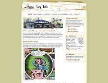
The HTML and CSS for this site is as clean as a whistle. But perhaps most striking are the images that all fit so naturally into the site's interface. Great looking site.
Color Scheme
- Hovered color:
- Selected color:
Comments (3)
Nice looking site! The only 'but' is the navigation menu at the top. The horizontal links list at the top display without spaces between each link when viewed in I.E 5.0 on Windows.. though not suprising (it's I.E after all). Anyhow a nice looking interface and very imaginative too.
You're right! Fortunately the links look fine in IE5.5, which makes up a good bulk of the remaining IE5.x users I suspect.
Very creative design. I just love how the envelope gives it that artistic appearance.


 Retrieving RSS feed(s)
