CSS Gallery  Two columns, Blog Designs, Horizontal CSS Menu, Web Design Firms
Jina Bolton
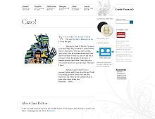
Note: Screenshot updated August 7th, 07'.
Color Scheme
- Hovered color:
- Selected color:
Comments (32)
ooooh, this one is the best ever!
;)
on a serious note, this site is a great site. good job!
Hi Jina:
Hehe, thanks for the "compliments." I really do like your design. I noticed though that the design looks different between Firefox and IE- the "frames like" design comment was conjured up when I first used Firefox to view it.
Yeah, Jina's site is pretty nice. I don't like how it lookes different though in different browsers, mostly cause I'm still a big IE user and it looks very, very off from what it's spose to. I try to make my sites so they look the same in all browsers, and really, it's not that difficult to do.
The design should not look different - it should be functional in every browser, and it is functional in every browser. I design for forward compatibility. I just gave an added "bonus" to those using modern standard-compliant browsers. Those using IE do not lose anything except for the "frames like" functionality. There is nothing wrong with giving a little extra to those who have upgraded their browsers.
No, Luke, it's not difficult to do - again, my site is the same on all browsers. Only those on better browsers get an added bonus here and there.
I agree the design looks nice on all the browsers I've viewed it in. The only real issue I've since found is the comments form- all the inputs appear invisible on my monitor. I suspect they're probably using a very light background color that my Dell LCD monitor can't pick up. It literally took me a few minutes of clicking around before I found the comments "textarea". Hehe
lol, get all defensive why don't ya. A bad designer designs for forward compatability. A good designer programs for both forward and a limited backwards compatability. There's nothing "frames like" about your site. Your current layout is a disappointment. I think you try to fit to much "cool" things into it that it becomes uncool, and a poor design. No one needs stationary drop shadows at the top and bottom of the pages, nor overly used sIFR, and a color scheme that shows anything but style.
you have validation links on pages that aren't even valid. your CSS has errors. two of the five main links on your site are invalid, include the CSS and that's P of your site that you claim to be valid that isn't. must be the forward compatability.
I come from an education in which I am taught to defend my work. I was taught that if you cannot defend your work, then you do not believe in it, and are wasting your time.
I am glad to see that validation has finally become important to you. Unfortunately, I do not have that opportunity to validate everyone else's code.
I am sorry that you have a problem with the features on my site, but the three gallaries that have shown my work has shown my site for these very reason.
While I don't appreciate the personal attack, I do thank you for your opinions. Jealousy is the highest form of flattery.
I'm not a code geek, but I am a very experienced designer, and looking at both Luke's and Jina's sites, there's really no comparison. I guess that's why her site is featured. Nothing personal. Just an outsider's observation.
her site is featured not for a quality design, but because she targets it as a design site. mines a personal site thats existed for a very short period of time (1 Jan 2005).
for an experienced designer, you'd think u'd have a site to showcase, but you dont. Funny, isn't it?
validation is not important to me. it's a good practice, but in the end its a waste and pointless. if you display that you have valid code, then ur code should be valid, if not then dont have then link.
you have to get an education to defend ur work? haha, that's pathetic. and these are not galleries, these are lame wannabe design focus sites.
i'm not jealous either. i'd rather have my site than your anyday. the only reason michael sided with you is cause he feels sorry for you and thinks i'm a prick. i am a prick though, proudly.
my first comment was a compliment to ur site, i said it was nice, but then u attacked it cause i said it doesnt look the same in all browsers, and it doesnt.
I actually would have to say that Jina's design is quite impressive. On another note, Do you really have to be 100% valid? I mean, Micro$oft is far from being validated and there customers don't seem to mind. (Just a personal thought of mine)


