CSS Gallery  Mixed cols and rows
Kutztown University
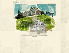
This is an unorthordox, and hence eye catching, design. I love the sketchy look.
Color Scheme
- Hovered color:
- Selected color:
Comments (3)
Very interesting, not just because the artwork is eye-catching and appropriate for the site, but because the curriculum covers nothing at all I did on a Communications Studies course, and I did none of their subject areas either! So two comms students can have a completely different world view! Great site!
I agree, the artwork definitely blends in very nicely here.
The site is very eye-catching, inspiring and ideal for an educational organization offering such curriculam. But the pages inside are a bit downer compared to the homepage.


