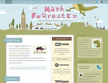
CSS Gallery  Two columns, Blog Designs, Blue color scheme, Green color scheme
Mark Forrester
Color Scheme
- Hovered color:
- Selected color:
Comments (3)
I think this page starts off real nice, but the right side of the page has very low contrast.
The illustrations are excellent though.
I also think the three column isnt working for you. I get confused when I look at the excerpts because my eyes dont know where to go .
Its got a great color scheme, just needs a little UI touchup.
Yes indeed the illustration are great and make this site unique
Very cool style but would love to see it without the wordpress style white box background. Maybe darken the green in a gradient down the page and try the content reversed out on top for a more seamless and original look - just a thought.


