CSS Gallery  Mixed cols and rows, Unconventional Designs, Web Design Firms, Brown color scheme
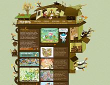
Meomi Cloud House
HTML could be cleaned up, but the design is very unique indeed, and that should count for something these days.
Color Scheme
- Hovered color:
- Selected color:
Comments (10)
I don't know who approved this, but this is not a CSS-based design but rather a slew of tables with CSS to set fonts and the background of the page. I'm appalled that you would have posted this, regardless of how 'pretty' it is.
Ditto...
Well, I thought I'd make an exception to the normal "rules" and guidelines when I decided to add this site. Its uniqueness and eye candy can be a great inspiration in themselves. :)
oh,it is interesting design.
absolutely, the web site is amazing~
i like it
Geez people, the ruels on the submission page don't even state the design has to be 100% pure CSS table-less... Anyway, I am so tired of the web 2.0 styled sites that get submitted and you can tell someone came up with the complete design in 10 mins.
This took a ton of time and the attention to detail is spectacular. This is the kind of web design that inspires people to create sites that break the conventional mold.
And they used plenty of CSS to justify this site being on here.
Ditto...I do agree that CSS Drive should only feature "Pure CSS" sites as tables are basically from the internet "dinosaur" age and shouldn't be used at all. But!, I do agree with the whole web 2.0 fad, I think they do all look generic and lack any soul whatsoever, and this site is fun and breaks from the carbon copy web 2.0 crap that we are currently being infected with. This site is fun and interactive and shows a real sense of imagination! great work!
An undeniably unique design that definitely showcases some real talent in the Flash department, too bad they didn't just spend the extra time laying it out with pure css to give it some accessibility.
Congrats for the amount of work in doing this - respect for the illustration!
So i understand that this website is for "...the creation of compelling visual experiences and narratives" which you obviously did it but maybe too much. There is so much details and...stuff in front of my eyes that make me go away. If i was a customer i deffinetly look for a more easy on the eyes portfolio.
I find annoyng that every time i move the mouse something moves and/or miaows :)
I gave you 3 stars for the illustration - not maximum vote because the code part is ... let's say bad.
Goodluck
Fricken AWESOME!! LOVE a creative mind!!! Nice job!!
I absolutely love it. First time I saw this, I was concerned about the upload time but on my broadband it feels all right. I don't care about the standarts, it is just sooo inspiring!


 Retrieving RSS feed(s)
