CSS Gallery  Two columns
Miavanloon
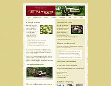
This rather non assuming design is pleasing on the eye nevertheless, and the rough borders surrounding it is a nice touch.
Color Scheme
- Hovered color:
- Selected color:
Comments (3)
I really like the way the site is split in half exactly 50-50, the split colour scheme works very well as does the art work.
If only I could read Dutch, then I'd be able to enjoy the content ;)
i agree that the colour scheme is very nice, it is serene but yet it is functional...
It is a nice site to watch and read (yes i am dutch)
the site is about a livery called ' het hof van venetie' ('venetie' as in venice, italy) who organizes trips in the surrounding by a horse drawn covered wagon... btw 'fotogallerij' = photo gallery, 'gastenboek' = guestbook
Wow. Man, there are multibillion dollar corporations in the world that don't have sites even close to as appealing as this one -- and all for a carriage ride. Gotta love the Dutch, they have their priorities straight. :)


