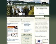
CSS Gallery  Two columns, Horizontal CSS Menu, Corporate or Professional, Green color scheme
Mission Regional Chamber
Color Scheme
- Hovered color:
- Selected color:
Comments (5)
Pros: Nice intro pictures. Easy navigation.
Cons: Ill used topography, the colour scheme is overused
6/10 ?
Looks shite in IE (especially v6)
The design is great, especially compared to most chamber of commerce sites. I like the pictures as well.
Sam: The site does not break in IE7, it looks great. What are you talking about?
Granted, something is wrong in IE6.
I agree, serious problems in IE...IE should be the first browser to render correctly considering the overwhelming use of that garbage browser!...I hate IE, but any site should render in IE before all others simply because of its domination...
Thanks for the comments guys. The site actually does work in IE6, IE7 as well as FireFox.
A problem arose when we implemented the CMS, which modified a ID in the HTML, causing some of the styles that IE6 relied on to fail.
We saw the problem quickly, tracked it down and fixed it. Feel free to check it out in IE6 to see how it looks now.
And as Andrew said, the site always looked fine in IE7, which according to our analytics is what the majority of users are browsing the site with.
Thank you


