CSS Gallery  Three columns, Clean & Clear, Horizontal CSS Menu, Corporate or Professional, Our favorites
NFA Services
Note: Screenshot updated Dec 12th, 06'
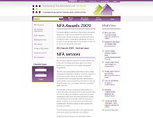
There is a feeling of crudeness with certain elements in this design, such as the builder image used for the header. I think that only adds to the design, which is a mixture of elegance and roughness.
Color Scheme
- Hovered color:
- Selected color:
Comments (3)
Extremely clean and neat! I like the diagonal lines created by the header images, the login box graphic and the gradient vertical line between the center and right columns. Some of the best designs seem to be from the UK.
Interesting observation about the UK bit. I have seen quite a lot of great designs from the UK and Australia. Not to stereotype of course hehe.
hello


