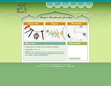
CSS Gallery  Two columns, Unconventional Designs, Green color scheme
Nicole Kidd
Color Scheme
- Hovered color:
- Selected color:
Comments (1)
Dear Nicole,
I understand that you're excited about the design of your site, but... the greatness can be find [or not!] in the details.
On nicolekidd.com there are some problems with the details...
For example:
1. The buttons of the navigation menu shouldn't have that dark green outer line [or they could have it in a more less "aggressive" way].
2. The curves of the towers should be smoother.
3. Finding the right color scheme is not easy... I think that the current color scheme is not the right one as the relation between the colors is not natural.
Best regards,
Zoltan Sebestyen
RespiroMedia.com


