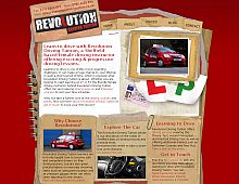
CSS Gallery  Mixed cols and rows, Unconventional Designs, Red color scheme
Revolution Driving Tuition
Color Scheme
- Hovered color:
- Selected color:
Comments (2)
hey i like this, nice concept. and the L's and P's + the notebook layout works.
first bad thing, the images comprising the notebook all seem quite low res, not crisp enough. if these were crisp you would be surprised how much better the site would look.
its all a little chunky for my taste eg. big text, big buttons etc. but i'm guessing you did this for a reason? i would have thought most people going for their drivers tests are under 18yrs old so are used to reading websites therefore not needing chunkyness.
but i still like, i think the crisp images would really help
Thanks for the comments, your point about the image crispness has really made a great improvement.
With regards to the text size, it is a little larger than I would usually use, but the general idea was to generate short and straight to the point titles and paragraphs for easy skim reading.
Chris


