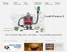
CSS Gallery  Mixed cols and rows, Clean & Clear, Gray color scheme
Sushi & Robots
Color Scheme
- Hovered color:
- Selected color:
Comments (4)
Its the fonts that kill it for me with this design. The textures, the layout, they are all not bad.
But the fonts are way too small to read easily. I would work on the fonts and then it will have a much better appeal.
The fonts look good to me, in fact I think this site's typography works well and harmonises with the illustrations.
Love the name... sushi and robots! 2 of my favorite things!
Very cool site! Please submit it to Australia's leading CSS showcase gallery CSS Downunder.


