CSS Gallery  Three columns, Clean & Clear, Vertical CSS Menu
Terroir Languedoc
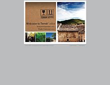
Simple but not boring design, thanks in part to the lovely header at the top.
Color Scheme
- Hovered color:
- Selected color:
Comments (3)
Agreed. Great, clean design.
Yes very nice! I also really like the menu. I love your site too by the way, I check the design submissions every week and am always coming back to use the code for that great blue blocks menu :) Thanks for running it!
I don't like it, really don't. I mean, the Languedoc is great and all, really. But this is only half done, the top is good, but the navigation and all the rest hasn't got my attention at all...


