CSS Gallery  Two columns, Vertical CSS Menu, Unconventional Designs
Tony’s Tattoo Studio
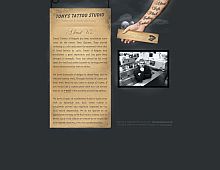
I love the unconventional navigation menu at the top, and the design is very nicely themed. One thing I'd improve upon is server speed. The gallery images load really slowly for me.
Color Scheme
- Hovered color:
- Selected color:
Comments (4)
Nice, but the layout breaks and text becomes unreadable if your font size is set larger than what the designer used.
John: and so what? It's a great design - maybe you could find something useful to say about it.
I think this is a quite a good piece of work... nevertheless i believe it is more useful point out that larger font size breaks the effect than simply saying "this is a great design"
Hey, I wonder if they'd tattoo "About,Info,Flash,Gallery and Contact" on my arm just like their site?!?...


 Retrieving RSS feed(s)
