CSS Gallery  Two columns, Clean & Clear, Vertical CSS Menu
Toronto Real Estate
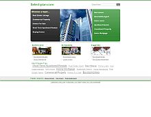
This is a great example of how bareness can be great. Just a few well placed dividers. The CSS list menu on the left is attractive as well.
Note: Screenshot updated Dec 6th, 05'.
Color Scheme
- Hovered color:
- Selected color:
Comments (14)
Wow, I love the design of this site! Very clean, inviting and easy to navigate!
Well Done!
Very elegant design. I just happened into this site and I can tell already that I have found what I am looking for. I am in the process of redoing my photography site so I'm glad I found you guys.
very goog merci
The site design is very well done. Quite impressed.
Cave Spot
http://www.cavespot.com
Toronto Real Estate Forum
I was very impressed by the design too, there aren't lot of sites with such elegant design.
I am trying to make my site also such impressive as this one, you can look the results of my effort:) on my site
It seems that I have found your weblog too late. I've tried to check out this website of my collegues, but something else keeps showing up. Too bad, as it really looks very promising. It very well might be a question of taste, but I personally like websites that look like pages in a book. I try to keep my site as bare as I can. So I don't go for black backgrounds much flash animation and so forth. I think bareness is great.
I like the design a lot - we need to overhaul our design at the same time. Nice!
very awsome design i like thenavigation of the site and the pictures mayke it look a way more better.
For some reason the page would not open larger, so i couldn't examine it complexity, however, you are completely right, simplicity often times goes a long way. Its like what i am told in math class, the simplest model for a system is usually the best one.
Very nice, awesome design


