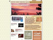
CSS Gallery  Mixed cols and rows, Brown color scheme
Travel Oregon
A very visually rich design. Yes, it's a Flash site, but featuring one every now and then never hurt nobody.
Color Scheme
- Hovered color:
- Selected color:
Comments (4)
Actually, it does hurt my impression of your site. If I wanted to see fancy flash sites, I would go to the wayback machine instead of the CSS drive. Granted the site is pretty, but not to someone who has to use a screen reader to browse the web.
Travel to Oregon, unless your blind...
Fair enough :) I think it's nice to mix things up a bit every once in a while, that's all.
I agree, but i like the site and don't want to see it lose any credibility.
I agree that the site is very visually appealing. As far as flash and screen readers, the Flash areas are largely for images...it seems any links within Flash are accessible elsewhere on the site. Unless I'm blind.


 Retrieving RSS feed(s)
