CSS Gallery  Mixed cols and rows, High Contrast/ Impact, Corporate or Professional, Liquid layouts
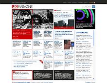
UX Magazine
The layout of this design and vibrant colors are just perfect for a magazine type site.
Color Scheme
- Hovered color:
- Selected color:
Comments (6)
good design to fit a bunch of boxes. The only thing I don't like is the big red box to the left
Loved this site for a long while...
Different to mark i like the red box, splits the design up a bit, i feel the "folded page" image on the right content box lets it down, breaks the block design style. Header is spot on.
Yeh, the red box is okay. But the rest is as crapped up as the CNN website. Too much little stuff, give me the scoops, the intresting stuff, not all of it. But when you choose an artical, it's ok, narrow textbox in the middle always keeps the attention...
<u>1.)Introduction</u>
One can find many articles regarding replicas, some good, most are miss-informed and some bordering on the ridiculous.What I intend to do here is clear the smoke away and leave you with a clear understanding on the points that matter which will help to assist you in choosing the right replica watch and supplier.There are many different types of quality produced but there are mainly six types or grades being sold on the Internet today These range from Swiss Grade One, (the top of the range) down to the lowest grade being grade Six (Street Market quality). However in this article I will be commenting on the top grade, Swiss Grade One.
This is a brilliant site, the design is top quality and I love the content more than that, a recent revamp compared to this screenshot shows a lot of improvement.
Nice job UX!
Cool layouts,I liked it, Free Gift Box Template


