CSS Gallery  Two columns, Unconventional Designs, Web Design Firms, Brown color scheme
Vincent Mazza
Color Scheme
- Hovered color:
- Selected color:
Comments (4)
coolest template i have ever seen
Huh!!? "Kiran" must be the developers Wife/Husband/Brother/Sister/Son/Daughter etc... obviously Kiran hasn't "seen" many templates/ websites!
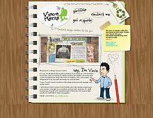
1) The repeating background image is just plain ugly! and it doesn't repeat seamlessly. look at that hard line below the site!! ( uugghhh! )
2) The pencil being "chopped off" at the bottom looks like an error, but the image is actually cut off... ???
3)"onmouseover" and "onmouseout" for menu!? is this 1998?
4) lousy accessibility! iamge for menu, no title tags?...if I can't see very well, how do I know where I am?
5)on portfolio..why force your potential clients to view your completed websites in a lightbox!? why not allow me to see the site in my browser?
that's just 5 minutes on the site!
This site works for early teenagers and the mentally disabled.
yes,.. it could be better done,..


