CSS Gallery  Mixed cols and rows, Corporate or Professional, Our favorites
Walt’s Bicycle Shop
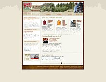
A nice warm blend of brown colors. The dark brown frame surrounding this design really helps bring it out.
Color Scheme
- Hovered color:
- Selected color:
Comments (8)
Neat website but I think it could be improved by the use of a contrasting background and better use of photography. I don�t know about the outer glow on the photos and the overall grey look doesn�t seem optimistic.
Other than that, nice!
Great stuff..although I do feel the background could have been touched upon..!
Ohh yeah, those colors match perfectly to the content of the blog. Glad to see more new designs.
change the background!
I like the brown color scheme. :)
ugly, 1999 look
I don't really like it. It's a little outdated for a sport website. Looks lazy and impassive.
Really good but you can arrange it better. The color is a little outdated.


 Retrieving RSS feed(s)
