CSS Gallery  Two columns, Clean & Clear
Wurkit
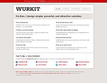
Simple yet obviously very elegant design.
Color Scheme
- Hovered color:
- Selected color:
Comments (7)
You have got to be kidding me. The web is a graphical medium and this is all text, not even a logo or a subtle graphic image. No one wants to look at a computer screen that is 100% text.
Really? I guess it's just a matter of taste, but I really liked this design. I didn't even notice it doesn't contain any images, only a plus if it still looks this good. :)
It has a very neat and clean look but there's no focal point, my eyes go all over the place and never find a place to begin reading. All the headings are nearly identical -- same font, almost the same size, and either red or black. Even the name of the site doesn't stand out from the other headings. Where do I start reading?
I've always thought of the web a text based medium. Hmmm.
Anyways, thanks for the criticism, it's still new and the design is still getting where it needs to be... I do see your point about there being no obvious starting position for the eye.
Thanks again for the criticism. And thank CSS Drive!!!
First, a nitpick: Why doesn't CSSDrive set a body background color in their CSS?
Second: Taki, you have got to be kidding me. If the Web is all about graphics, why doesn't your comment have any images? No one wants to look at a comment that is 100% text. I mean, c'mon, toss me a smiley or something. Ah, but mere text was sufficient for you to achive your goals, wasn't it?
The reality is that the Web is a communication tool, and if all-text wurks, then wurk it.
"First, a nitpick: Why doesn't CSSDrive set a body background color in their CSS?"
Fixed. :) Just one of my many oversights when whipping up the CSS for this site.
Another fine example of goodness coming out of AZ.


